A Confluence of Art - The Interior
INTERIOR MURALS, PRINTS, AND WALLCOVERINGS
In part two of our three-post series on local artwork within and surrounding the project, we are examining the interior. The building offers three unique art and graphic experiments that differentiate the levels and offer unique perspectives on our place.
For residential and commercial unit availability, please see confluencefc.com. While these works are on the interior and not accessible to the public, please get in touch with the residential sales team at The Group to schedule a tour, or you can currently visit the sales office on the ground floor of the project, facing Linden Street.
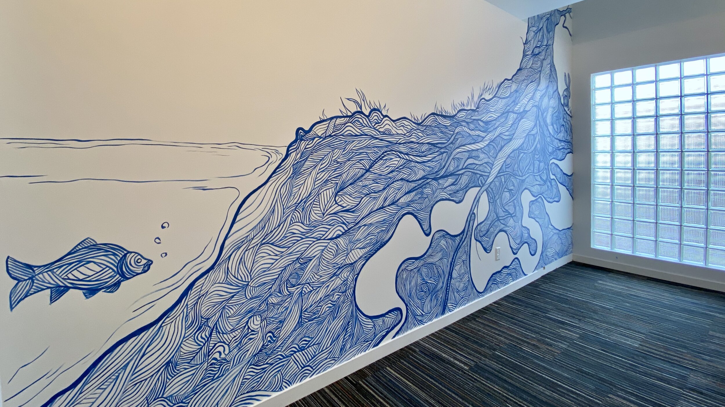
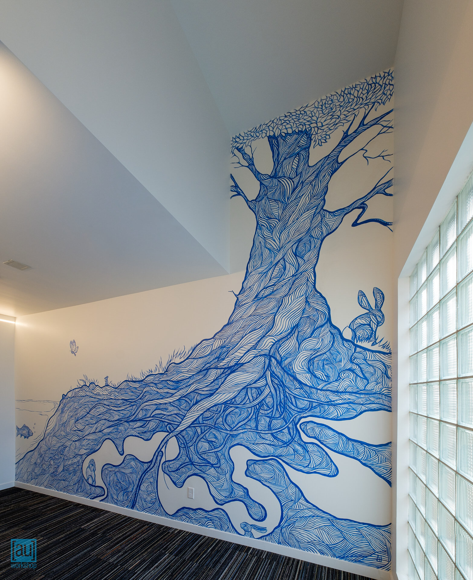
Confluence, Daniel Crosier, Visual Artist
Paint on drywall in the building’s shared mail room and elevator lobby, at the courtyard level.
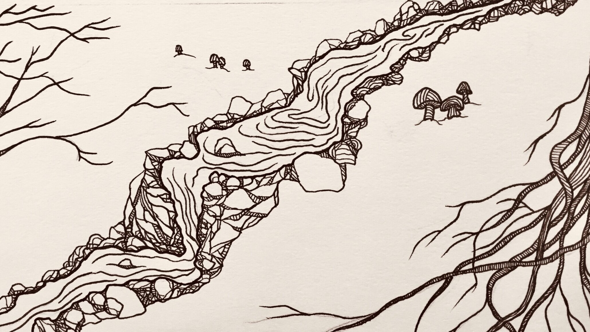
[au]workshop worked directly with Dan to arrive at a concept that took advantage of the wall’s unique shape and spoke to the beauty of the river habitat. The final concept explores an imaginary boundary between the river and its bank and the flora and fauna that inhabit it.
This space is on the property line, and as such is not permitted to have any unprotected openings, but glass block here provides a welcome natural light that adds additional dimension to the piece.
“Rendered in vivid blue paint, Dan’s signature linework breathes movement and depth into each subject in the mural. ”
Various, Steve Keating, Fine Art Photographer
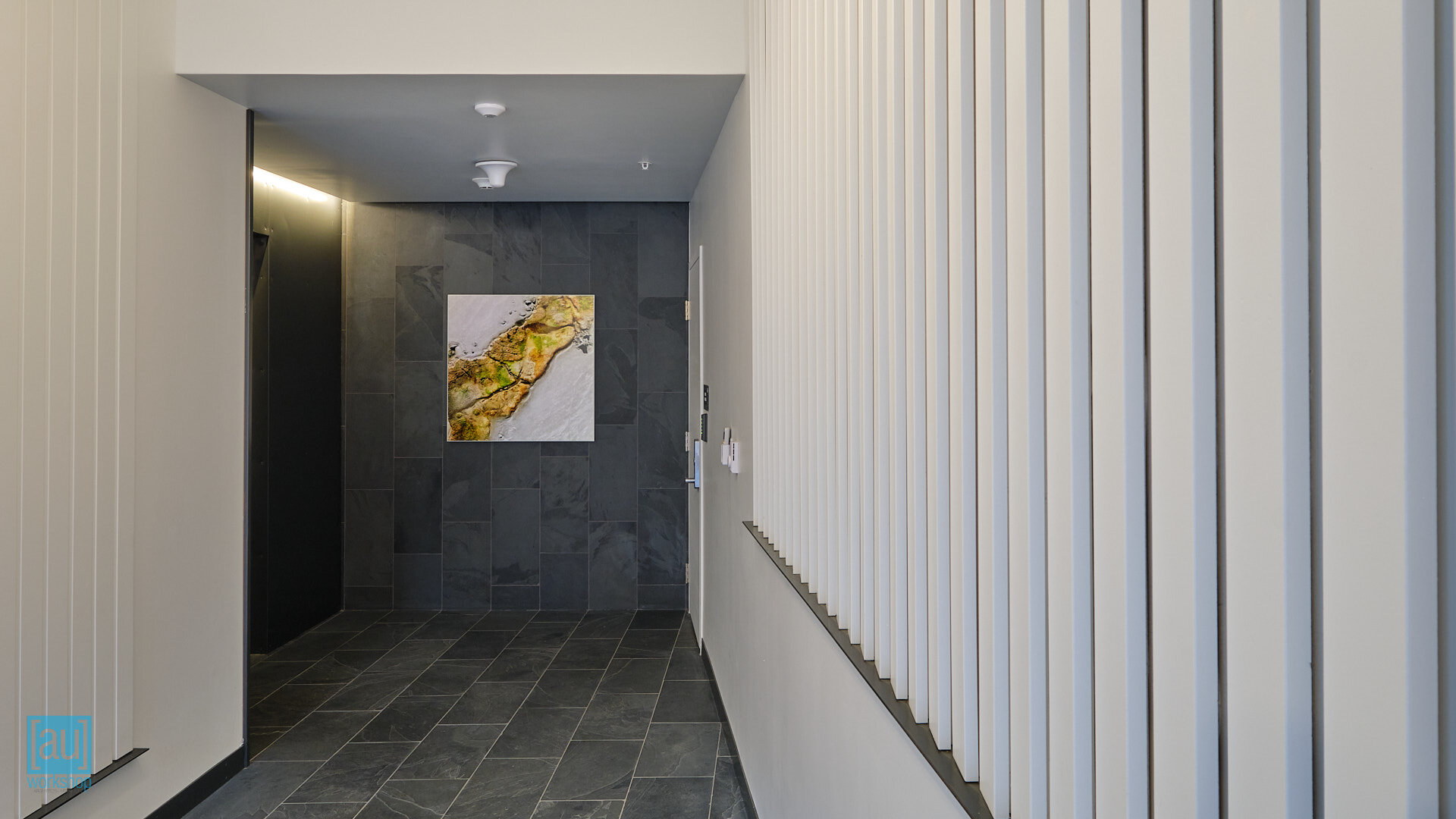
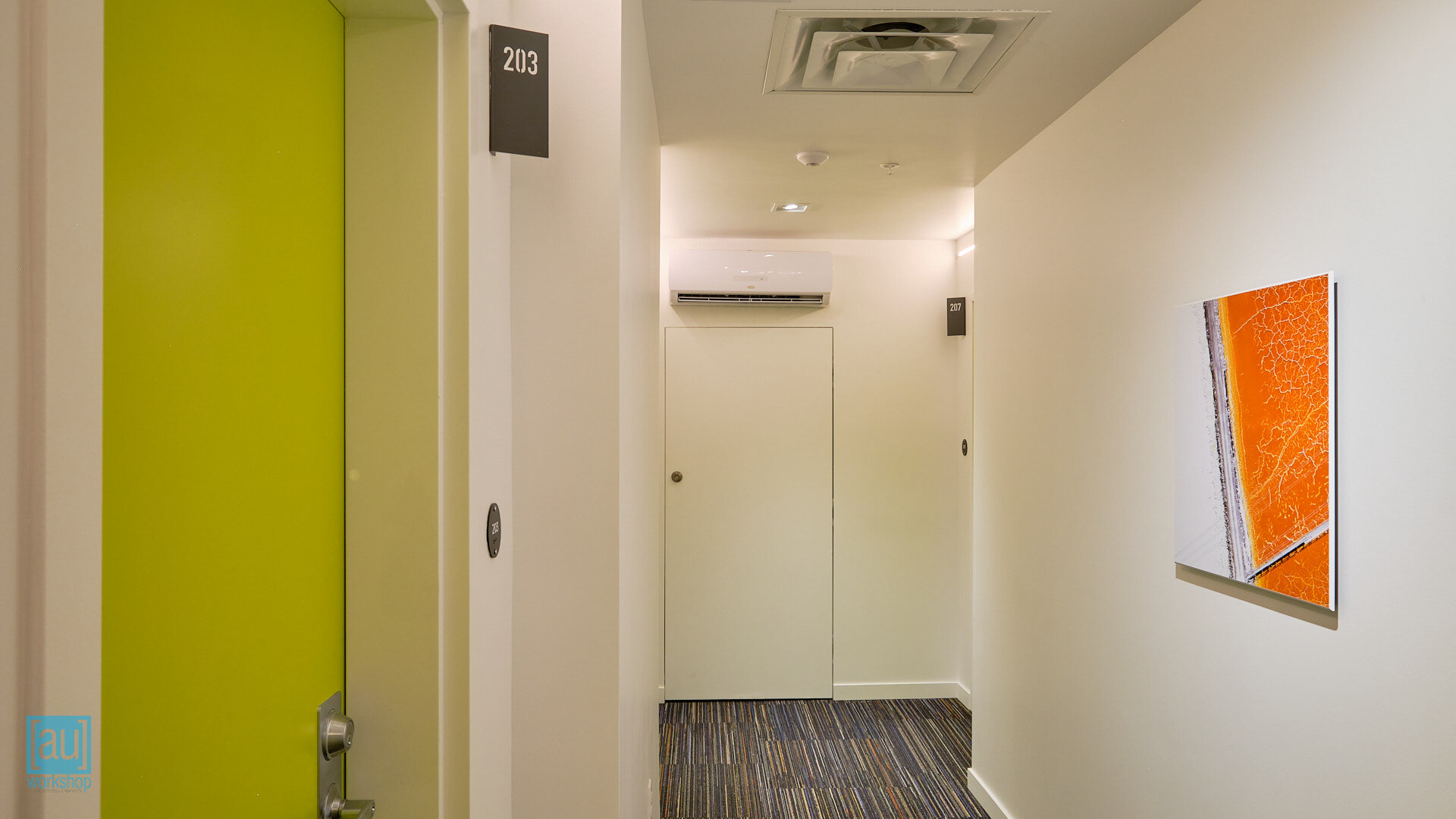
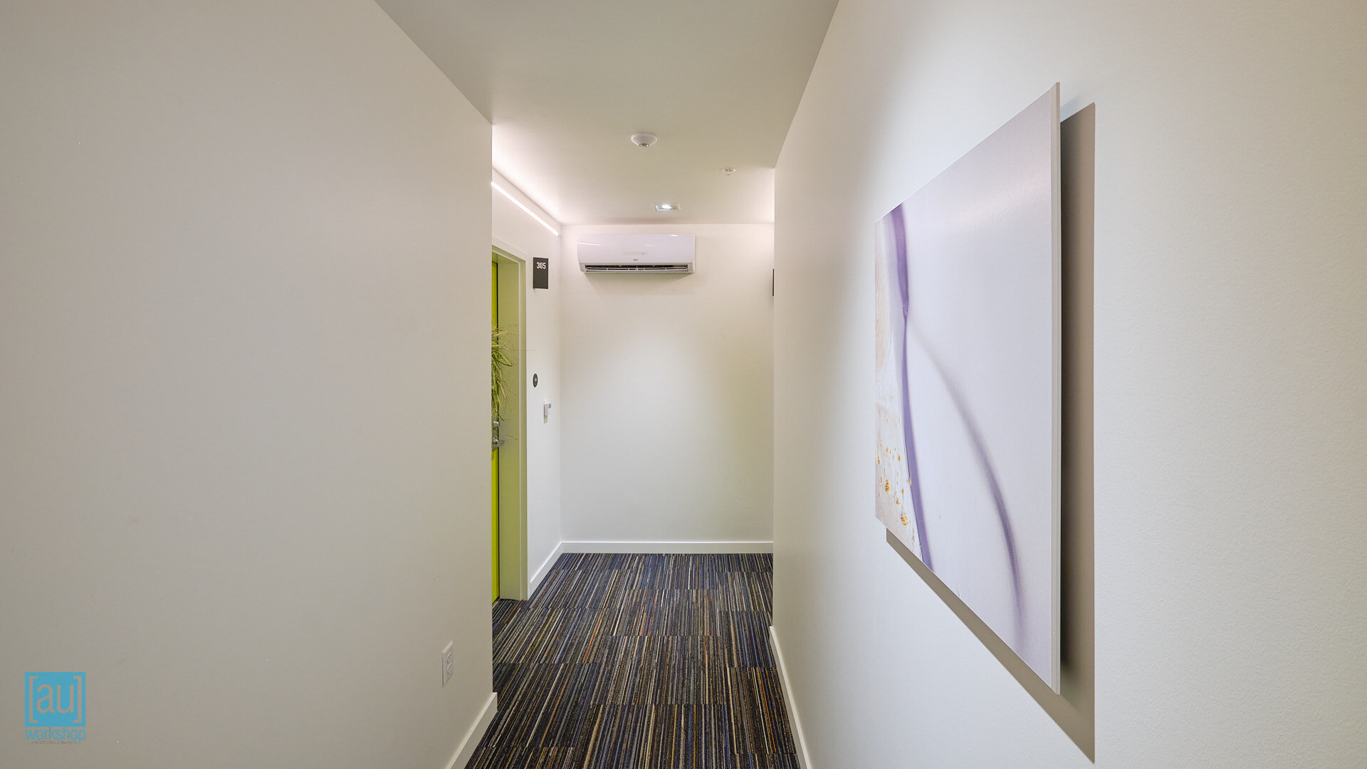
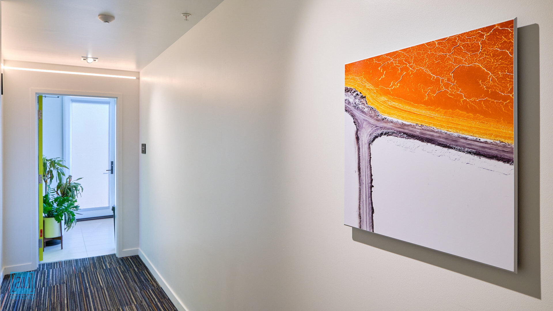
In searching for a cohesive art program for the Building 1 corridors and the entry lobby, we landed on aerial fine-art photographs from local artist Steve Keating. We selected images together from his collection, each featuring a kind of ‘confluence;’ literally a meeting of two rivers in one image, but a merging of roads and shadows in others.
Steve’s images are taken from a kite, with no knowledge about what he is capturing, which introduces a lovely sense serendipity to these ‘confluences.’ You can read more about the process on his website.
The prints are archival pigment photographic print under lamination on metallic paper on board. The metallic paper, in particular, adds light and sheen to contrast the slate wall of the elevator lobby, while remaining highly visible and preventing glare. The lamination can be wiped clean (ideal for a shared corridor) and also adds UV protection.
The frameless mounting with white edge banding is a very clean look and we feel fits well with the architecture.
“I lift the camera with a kite and walk it around with absolutely no idea as to what the camera is seeing and have no control over what is being captured. This is by intention as I don’t need to know what’s going on. It is a demonstration of letting go of control, or having faith. The only guidance I give the kite is to adjust the height, position it by walking around and keep it from blowing away. That’s all that needs to be done. ”
N/A, Erik Cox, Wise Ape Design Agency
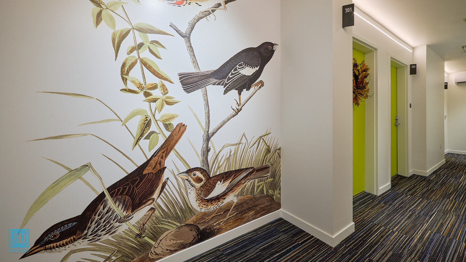
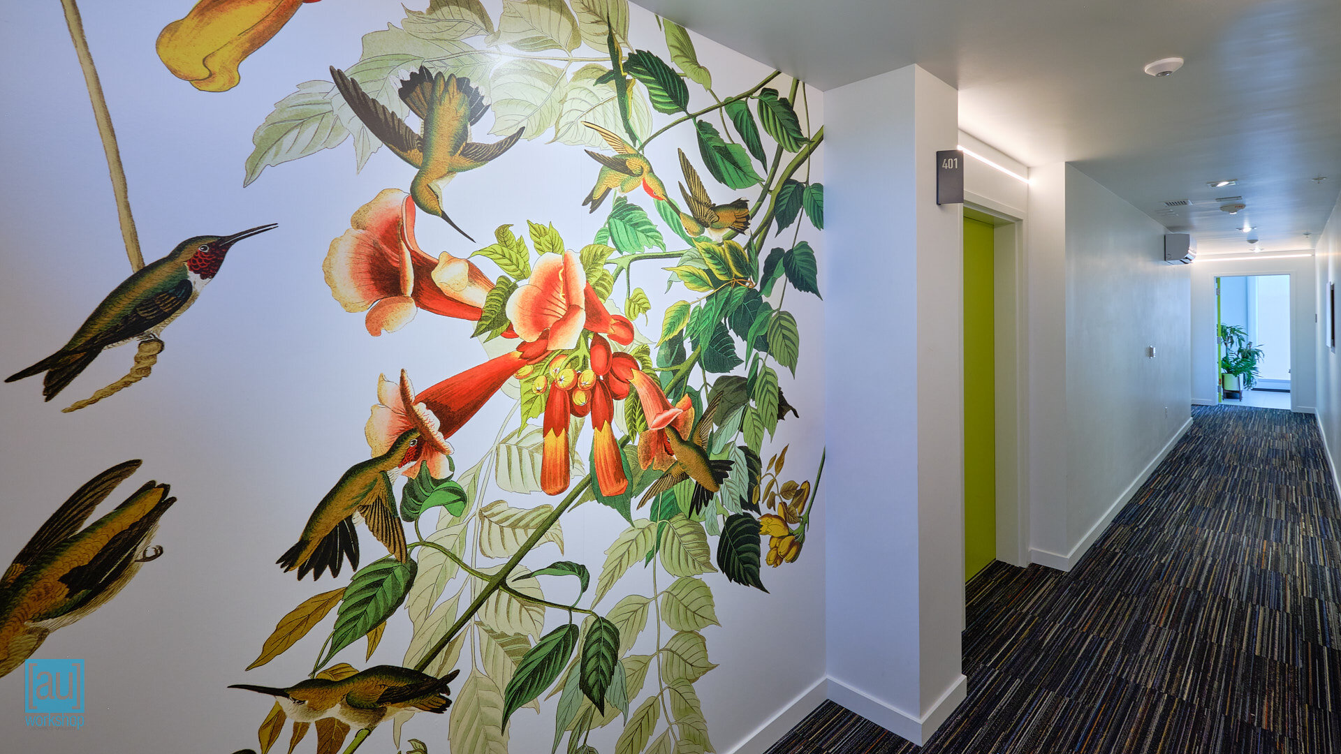
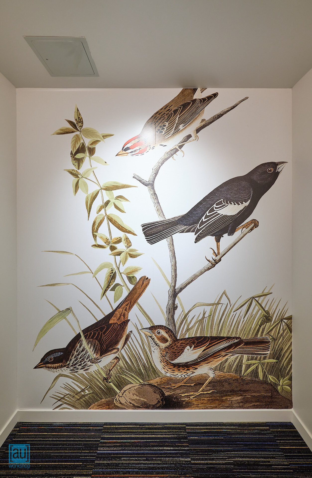
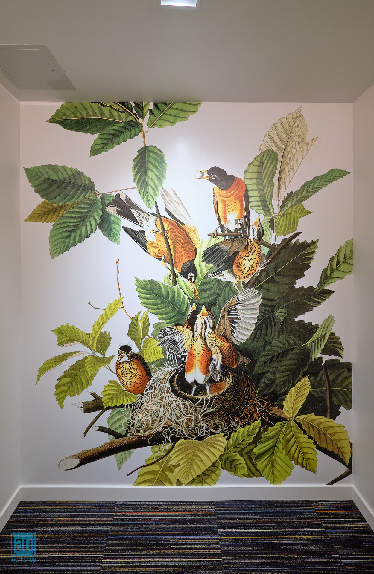
Large scale selective reproductions of engravings by ornithologist John James Audubon depict birds and the environments they inhabit. As the project, and the River District in general, straddle the line between the developed and more natural worlds, it seemed appropriate to bring some human observations of nature to the project.
The highly magnified scale of the prints brings the incredible detail of Audubon’s engravings to the fore. Prints were selected to work with the carpet and paint colors chosen for the space.
A different print on each floor is visible immediately as the elevator opens, giving each level a unique identity.
Heavy-duty 3M vinyl, printed and applied by Action Signs, should keep these prints in perfect condition for years to come.
“As I grew up I was fervently desirous of becoming acquainted with Nature.”
![[au]workshop: Architects + Urbanists](http://images.squarespace-cdn.com/content/v1/5116772ce4b0a31c035e701a/1485294861983-QVVSFP64I0OD7HTADAA6/170123_solid+transparent_Base+solid+transparent.png?format=original)
